Varadinum
Translations
We give meaning to your words!
Roles
Branding, UI/UX Design, WordPress Development
Release
2017
The Story
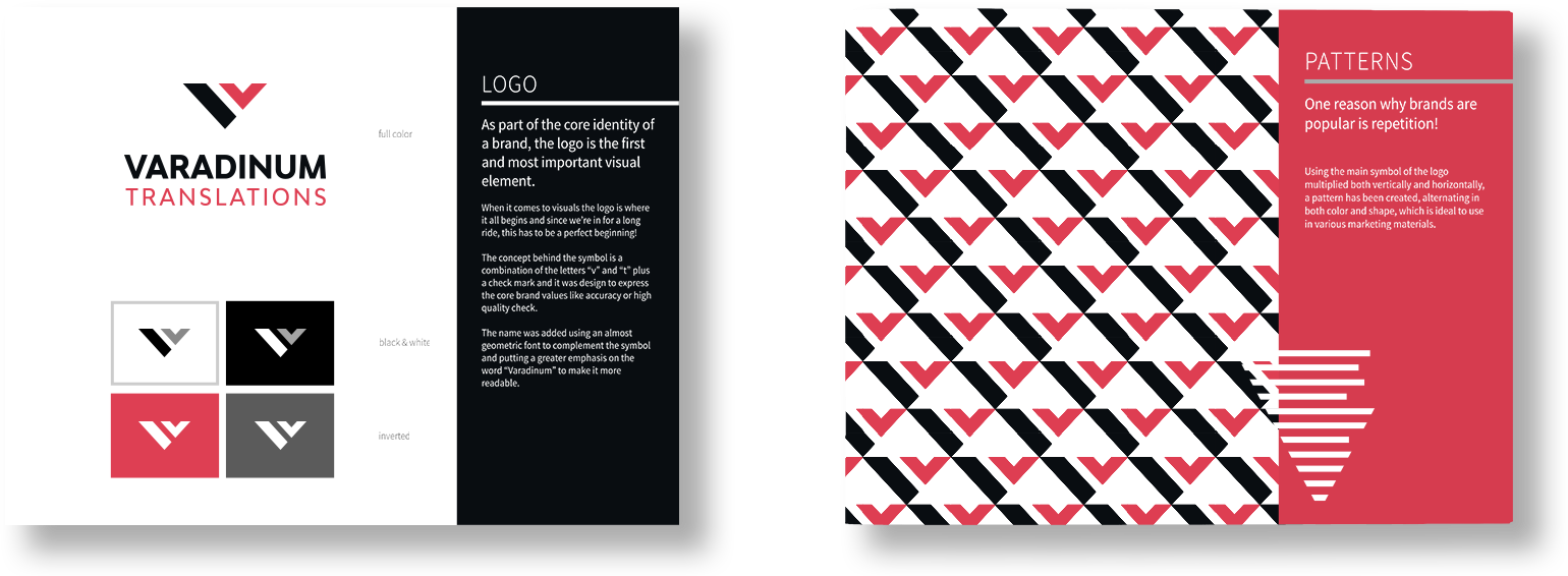
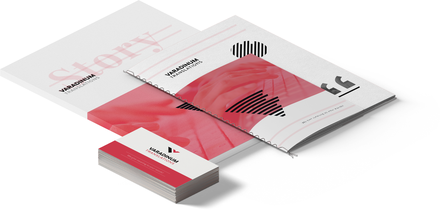
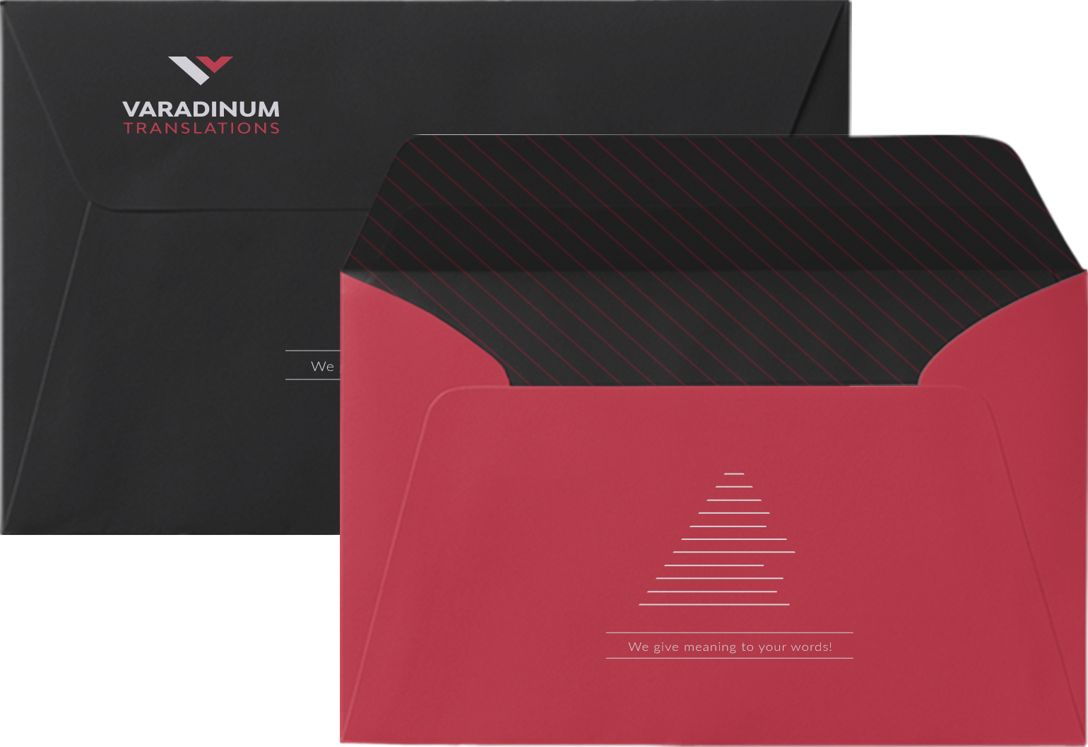
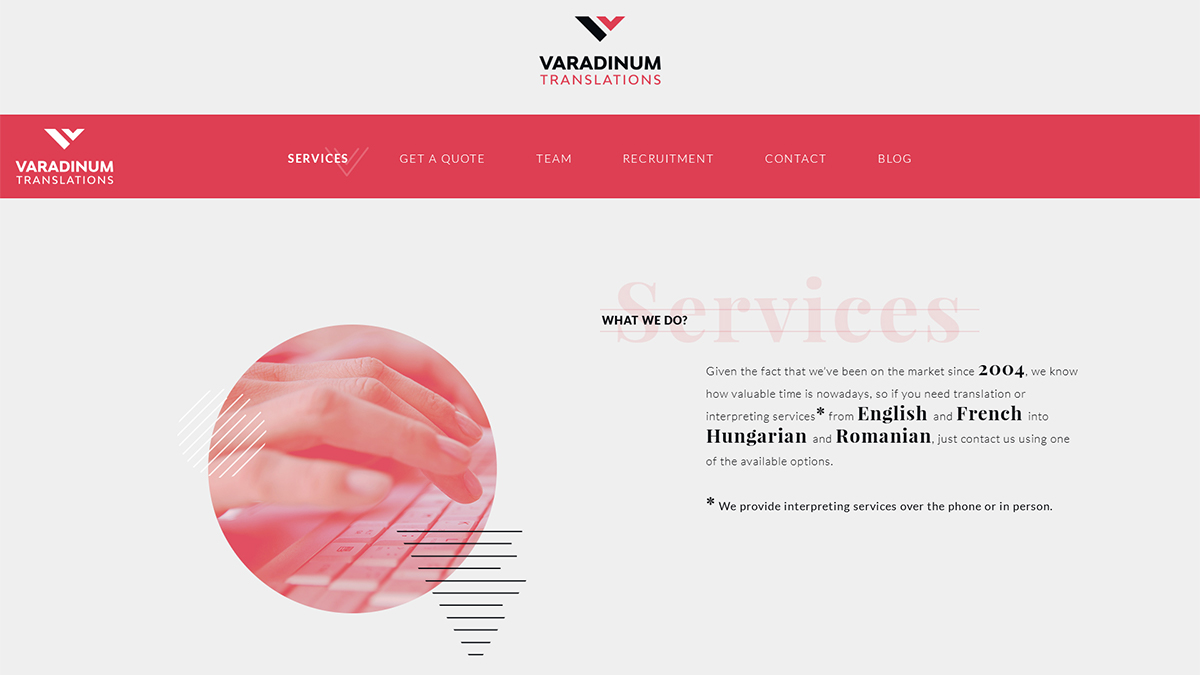
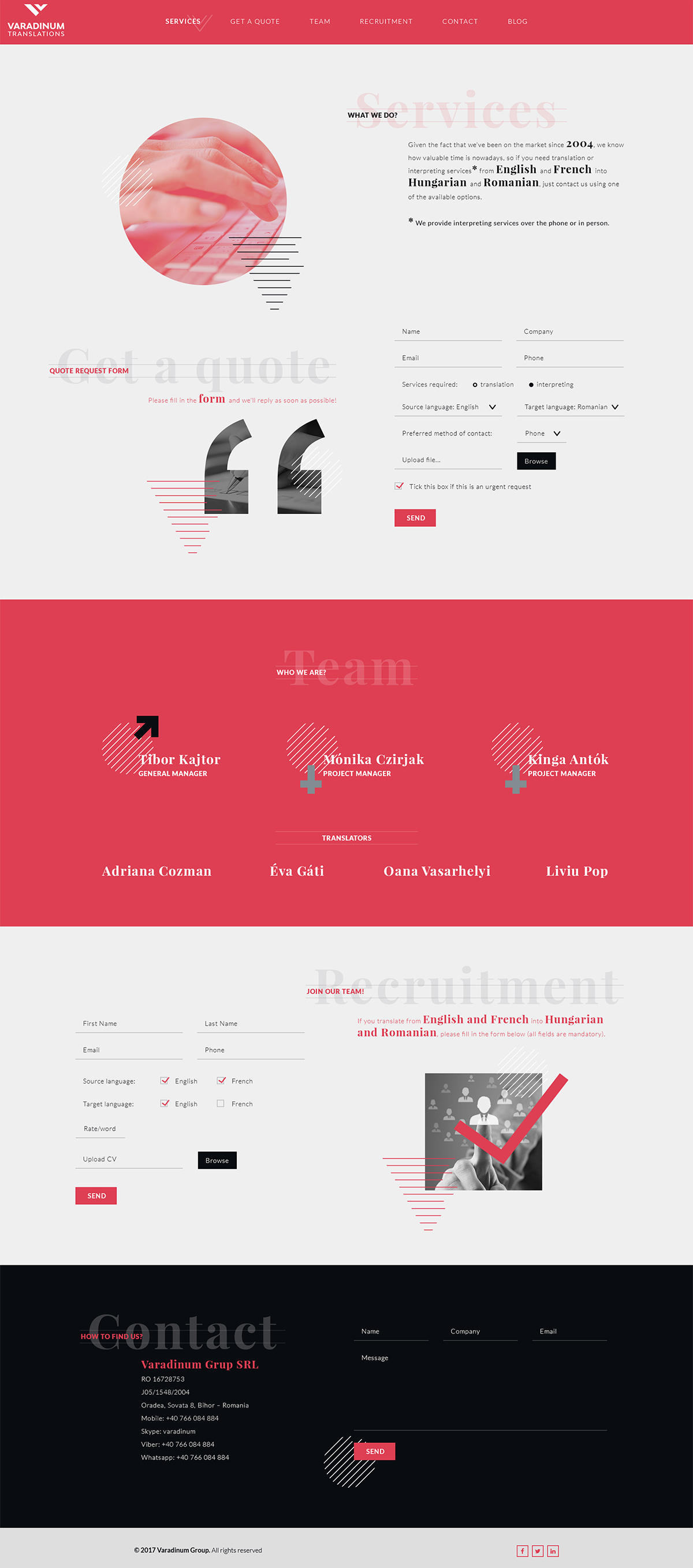
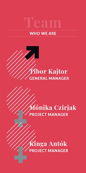
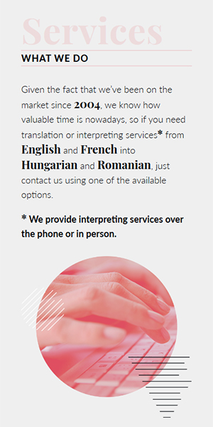
Nothing makes us more happy than when an old client becomes an new client again. A few years ago we did the branding and web design for Varadinum Translations, a local translation company with international clients and now they needed to get both branding and their website more up to date with the current design trends. So we improved on the old logo and colors and replacing the skeuomorphism with flat and clean design. The result was spot on with what the client wanted and for us was a pleasure to work with him again.
Logo Design
Main Attributes
Accurate
Professional
Prompt
Reliable
Color Palette
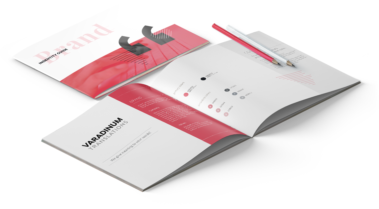
The color palette was a challenge because we wanted something that stood out compared to the competition so we ended up with a mix of cold red paired with dark gray. This was a great combination that looked great on print materials and on the website as well.
#DE3F53
#090D12
Typography
Typeface
Playfair Display & Lato

Mockups

Next project
Copyright 2026 © INK9 Creative Agency. All rights reserved |